


Client: Conquest Martial Arts Academy
Role: Graphic designer / Copywriter
Output: Branding
Year: 2020
About the Project
I was tapped by a former client to design the branding assets for one of his new projects, a martial arts academy based in Manila, Philippines. The client had several options for the name of the academy but ultimately selected the name 'Conquest.'
Design Concept
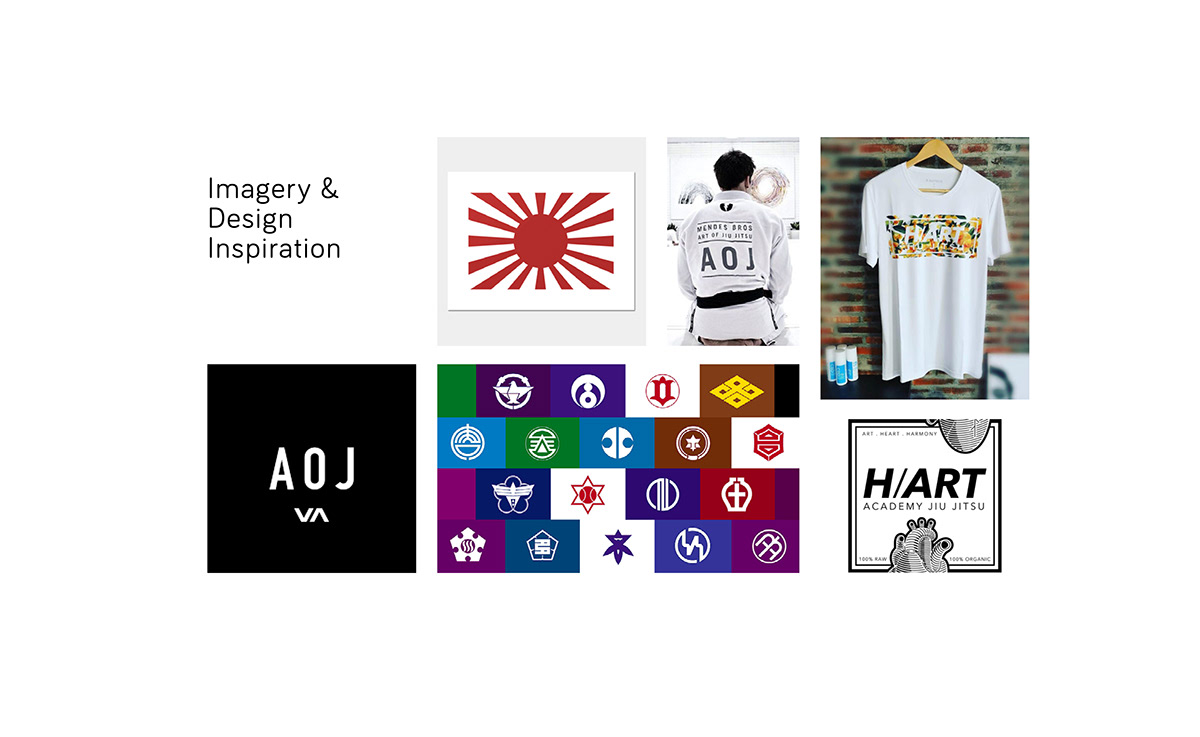
Prior to the ideation phase, the client already had some ideas that he and his stakeholders wanted to incorporate into the branding concept. They envisioned Conquest as a gold standard training academy that not only catered to a local Manila-based market but to a wider Southeast Asian market as well. The name 'Conquest' in itself was selected on the basis of the strong positive emotion it evoked: the overcoming of fear and challenges. Visually, the client wanted something simple and yet had powerful impact. Another design specification was also logo versatility. The client suggested the Japanese war flag as a primary inspiration. In-line with this, I also suggested looking to Japanese district emblems to see how simple forms communicated key traits. Other visual inspiration came from existing BJJ organisations and brands such as H/Art Academy and AoJ (Art of Jiujitsu).
Logo Exploration
The initial round of logo exploration produced type-driven studies that focused on visualising the traditional BJJ garb called the Gi, specifically the belt knot and the collar design of the robe. The client was happy with this idea however, he felt that none of the studies successfully captured the brand's spirit. Concept 02 was selected to be explored further.
Final Logo Concept
The concept of the Gi was further developed into a logo mark that resembled the letter 'C' which was then coupled with a boxy, geometric word mark made using the Chakra Petch font from Google Fonts. A red tag was added to the logo mark to symbolise the belt worn by BJJ Grand Masters. The logo mark was also designed to serve as a 'mask' that could be filled in with images very much like how the classic MTV logo was used in the 2000s. To further demonstrate the versatility of the logo mark, its components were deconstructed to form abstract, customised patterns that could be used for merchandise.
The document consisted of the fundamental branding elements: the logo, colour palette, typography, imagery, graphics, and logo application samples (the collaterals). Images were sourced from royalty-free sources such as Freepik and Pixabay.
Final Output
The final package consisted of the branding elements, the brand bible, as well as a number of sample applications for standard collaterals such as stationery, printed marketing materials, and social media templates.
Client Concept
Logo Studies

Selected Concept


Final Logo and Variations


Brand Bible


Branding Collaterals


Social Media Assets


Customised Patterns


